Analysis
Analysis
Analyzer is one of the components of Loadrunner which is used to
analyze the test results data. It converts the raw data to readable data in the
form of graphs.
Before analyzing, the result file will be in .lrr extension. After
analysis, it will become .lra file.
On analyzing the results data, it shows the summary report which
looks something like this
Summary report contains all the high level details about the test.
It also shows all the transactions and its response times.
Running VUsers graph
This graph shows how users are ramping up and ramping down. Using
this graph, we can find out details on user load throughout the test.

Hits per second graph
This graph shows you the number of hits made on the server by
VUsers during load test. This graph helps you evaluate the amount of load
VUsers generate in terms of number of hits.
A hit is a request to the server for a file (web page, image, java
script, etc.). When a web page is downloaded from a web server, the number of
hits is equal to the number of files requested.

Throughput graph
Throughput represents the
amount of data that the Vusers received from the server at any given second.
Throughput is referred in terms of number of bytes.

Average transaction response time graph
This
graph displays the average time taken to perform transactions during each
second of the load test. This graph helps you determine whether the performance
of the server is within the acceptable minimum and maximum transaction
performance time ranges define for your system.

Average transaction response time under load
This graph shows the average transaction response time against the
user load. This graph will help you know how the average transaction response
time is varying when user load varies.

This graph displays the number of errors that occurs during each
second of the scenario run.
Total number of transactions per second

This graph displays the total number of transactions that passed,
total number of transactions that failed and the total number of transactions
that stopped during each second of the test run.

Time to first buffer breakdown graph
This graph displays the time period between the browser request
and the first reply from the server for a particular page. It provides high
level network and server time.

Page download time breakdown

90 Percentile
The
90th percentile is the value for which 90% of the data points are smaller.
The 90th percentile is a measure of statistical distribution, not unlike the median. The median is the middle value. The median is the value for which 50% of the values were bigger, and 50% smaller. The 90th percentile tells you the value for which 90% of the data points are smaller and 10% are bigger.
Statistically, to calculate the 90th percentile value:
1. Sort the transaction instances by their value.
2. Remove the top 10% instances.
3. The highest value left is the 90th percentile.
Example:
There are ten instances of transaction "t1" with the values 1,3,2,4,5,20,7,8,9,6 (in sec).
1. Sort by value — 1,2,3,4,5,6,7,8,9,20.
2. Remove top 10 % — remove the value "20."
3. The highest value left is the 90th percentile — 9 is the 90th percentile value.
There are ten instances of transaction "t1" with the values 1,3,2,4,5,20,7,8,9,6 (in sec).
1. Sort by value — 1,2,3,4,5,6,7,8,9,20.
2. Remove top 10 % — remove the value "20."
3. The highest value left is the 90th percentile — 9 is the 90th percentile value.
Network issue


Graph options
Below are some important options available in graphs
1) Merge
2) Auto
correlate
3) Set filter
4) Drill down
5) Granularity
1) Merge
graph
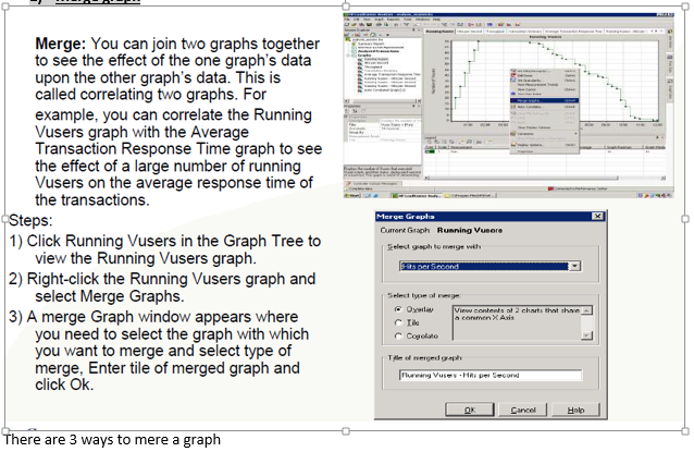

There are 3 ways to mere a graph
2) Auto correlate
2) Auto correlate


4) Drill
down


5) Granularity


nice
ReplyDelete